Making Pinterest inclusive for all levels of vision
Today we’re announcing updates across our apps and website for people with disabilities. All new UI components of Pinterest are now more inclusive for people who are blind and visually impaired. As a result, it’s much easier for you to browse, search for and save ideas on Pinterest.
Our mission is to help you discover and do what you love, and we want everyone to be included in that mission. That’s why we partnered with Lighthouse for the Blind and Visually Impaired to better understand how we could make Pinterest more useful for people with different levels of vision.
After talking to Pinners and finding out how Pinterest was (and wasn’t) working for them, we did an accessibility audit and created a list of areas to improve. Some of these include:
-
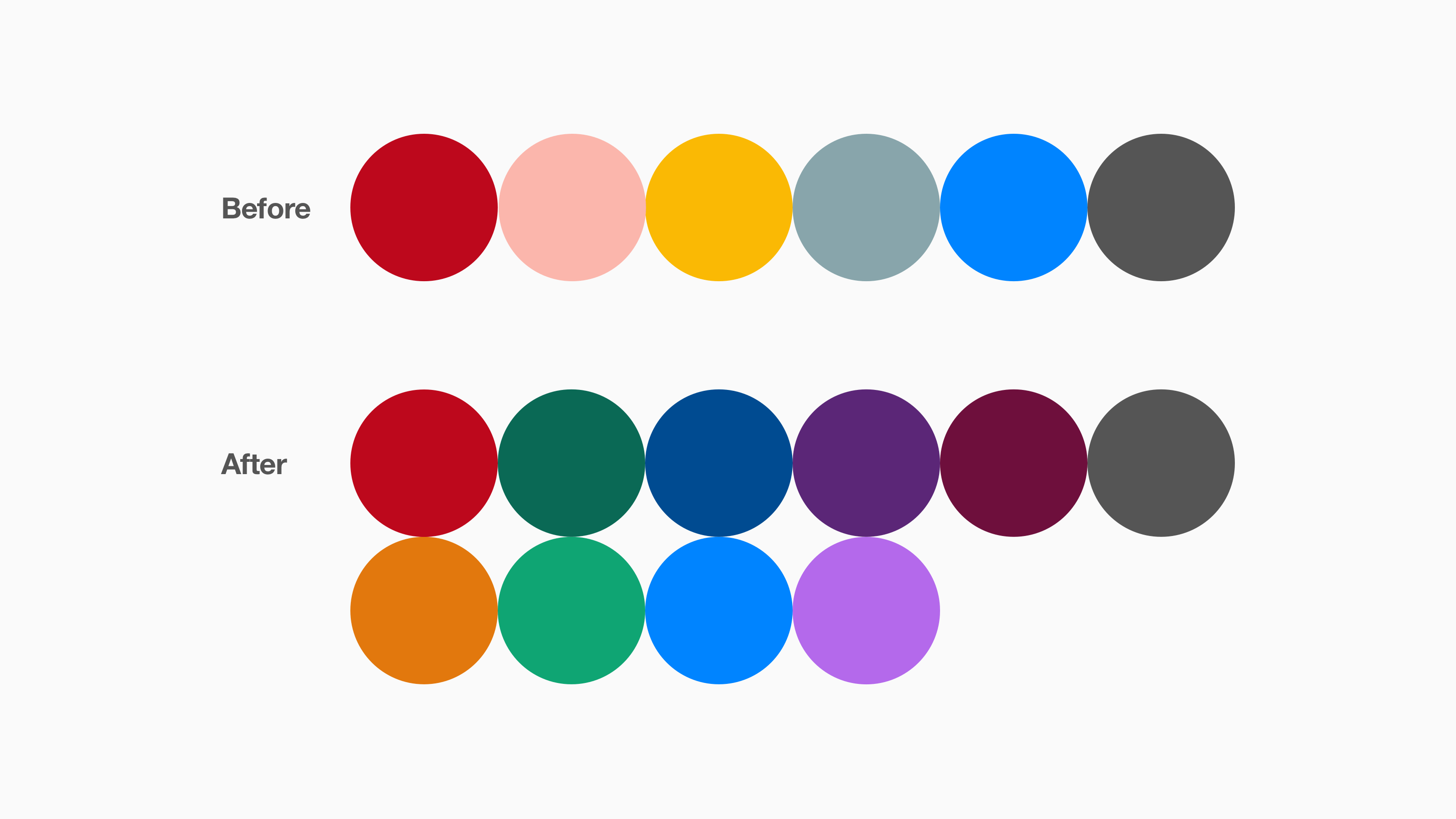
Colour contrast sensitivity improvements make our colour palettes more readable and easier on the eyes. This is especially helpful for people with sensitivities to bright colours and those who have low vision.
-
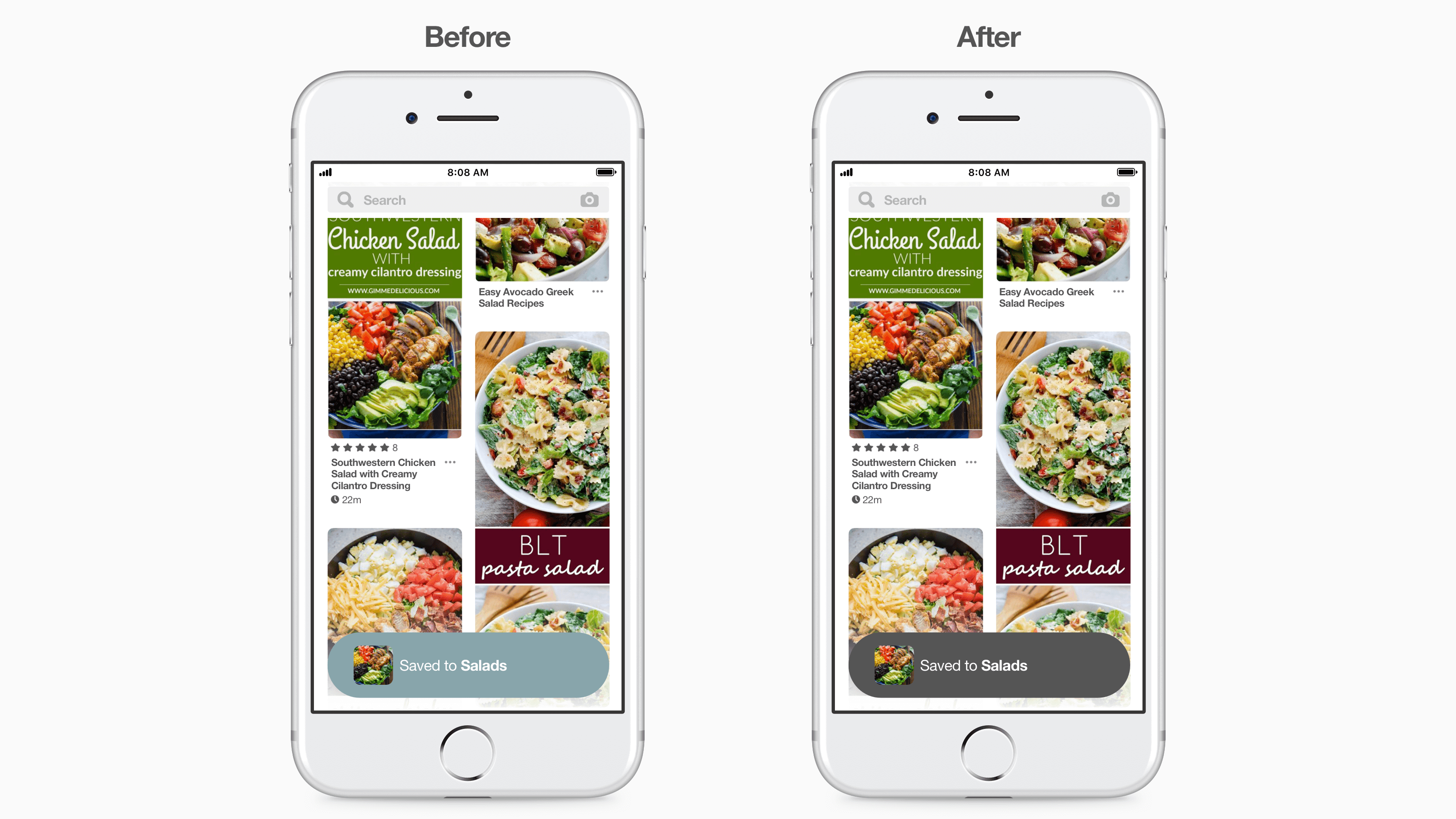
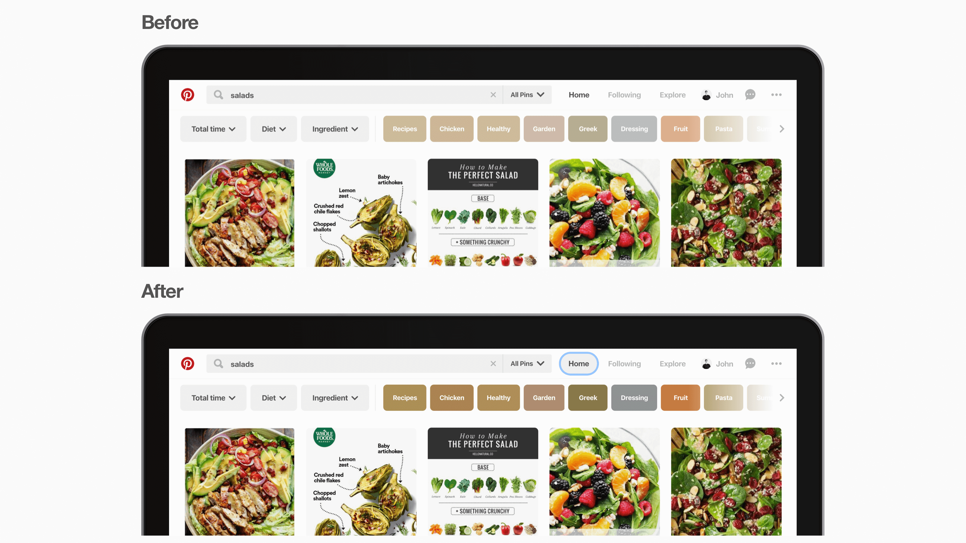
Focus indicators help people with mobility or visual differences to use a keyboard or another device to navigate to see which part of the site is in focus.
-
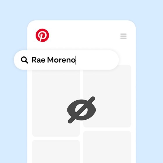
Better screen reader support makes signing up, browsing and saving easier and more usable.
We also created accessibility best practices for engineers and designers, in addition to a new UI library with accessible components. As we develop and design Pinterest, accessibility checks are now in place to ensure that we have clearly labelled icons and components for any new features.
We’re continuing to make Pinterest more inclusive for everyone. We’ve made significant progress updating our iOS and web platforms to meet the majority of the accessibility standards, and we’re working on bringing these changes to Android soon.
New features enhance teen safety on Pinterest
Introducing Premiere Spotlight and Travel Catalogs

Pinterest celebrates Pride with Tastemade exclusive content series and Sasha Colby board drop
_0.png?crop=center%2Ccenter&fit=min&h=560&ixlib=php-3.3.1&w=560&s=78cfdbf0a1cda734b885a8d10a09a5ae)
Our H2 2022 Global Transparency Report
Introducing an easier way to create and inspire on Pinterest

Pinterest reveals that 2023 wedding trends will be unconventional: Gen Z styles and budget ideas
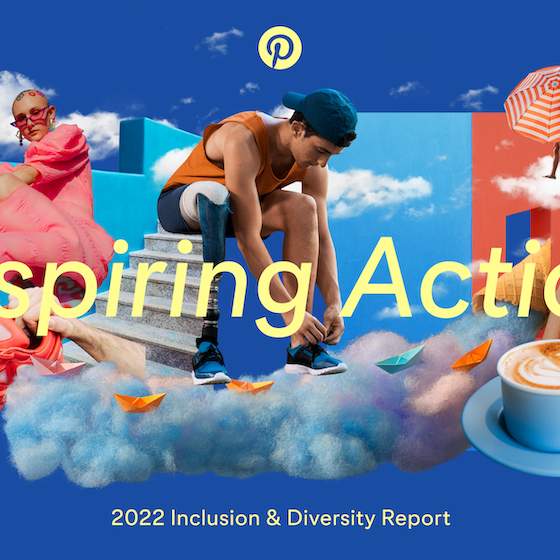
Inspiring Action: Pinterest’s 2022 Inclusion & Diversity Report